Close To My Heart

Wednesday, September 30, 2015

Paper Garden Happy Birthday Card

Today's the last day to avail of this month's Stamp of the Month by Close to My Heart and as a last hurrah, I'm sharing this birthday card I made for a special young lady. I thought of giving this to her, then later on decided it's probably not age appropriate so I made another one instead, which I will share after I've given the card.


I used Canary cardstock as base, Kaleidoscope paper to layer, and stamped the flowers from Paper Garden stamp set. I used Sweet Leaf, Gypsy and Blush inks, rolled the cardstock so the petals and leaves curl up a bit. I applied a very light sky blue background using Aqua Dolce Gelato and punched tiny flowers on Gold Shimmer trim to embellish the card a little. I am so hooked with the Gelatos. Will definitely use more of it in upcoming projects.

Here's the Kaleidoscope paper pack which I absolutely adore!!! Don't you just love the colors?

Hope you guys like it!

Sunday, September 27, 2015

Paper Garden Just Because

I've been coloring too much lately and thought I'd take a break and make a card out of Close to My Heart's stamp of the month set. I love this Paper Garden set. I think it has this vintage look to it, and you can stamp it with so much color or just go monotone or give it a bit of a muted tone. Either way it's such a pretty stamp.


I've recently bought more Faber Castell Gelatos and have been using it partly as watercolor in my coloring craze. I love how versatile these Gelatos are, and they are perfect for backgrounds. You get to mix and match as many color combos as you like, make it as vibrant or as subtle as you like. So the background is a mix of Lemon and Butterscotch gelatos.

I stamped the flower with Versamark ink, heat embossed it with clear embossing powder. And then I used Jacquard Pearl Ex Pigment Powder to paint over the stems, leaves and flower. I love the way it turned out! You can't see the shimmer in the photo, but I swear it's there. I just love how it turned out! Lastly I embellished with a few gold sequins.

Hope you guys like it too! If you're interested in this stamp set, here's what it looks like. Remember it's only available for this month of September! Grab it while you still can! 

S1509 Paper Garden

Don't you just love it? I'm really a sucker for floral stamps...

Enjoy!


Saturday, September 19, 2015

Redoing Twilight

As promised I made another go with the image Twilight by Crafts and Me. This time I used Derwent Coloursoft. I wanted to try just how waxy this brand is, and color wise, how vibrant. I am happy with the colors, pigment is very vibrant, and it's not far from Prismacolor. I love especially how the bricks turned out, and the skirt too. I still had trouble with the wings, and the thunder I'm not so happy about. I did try using Derwent Burnisher to cover the tooth, but I don't think it worked. I also did try the Derwent Blender, and like the Burnisher, I don't think it did anything at all.


I used Strathmore 300 Series Drawing paper still, so as to get an apples to apples comparison. Since the Coloursoft pencils are very creamy and waxy, I found that it takes less layers to achieve the same look as the Prismacolors. But the disadvantage it, it's too creamy that layering on more colors is also hard. A couple of layers in and the paper just can't take any more. You will feel the pencil just gliding, but not really blending. I think the right thing to do is to use it in conjunction with Derwent Studio or or Artist, but I was too lazy to try. Overall, for a first try, I am quite satisfied. It also taught me how else to do it better next time.

Here's a close up comparison.


If you want the specific colors I used, send me a note and I'll share them with you.

Thanks for looking!

Thursday, September 17, 2015

Faber-Castell Gelatos

So I've owned a few Gelatos for awhile now, and lately have been playing with it with my daughter. She loves the colors, the way she uses the stick to brush colors on her paper. It got me to looking at how much colors I actually own vs. what I still miss. If you know me, you know I'm just a regular crafter-hoarder right? So I started to make a spreadsheet of just how many colors Gelatos have, and which sets to buy in order to complete the colors.

 I didn't realize they have so much!!!! Goodness!


If I'm not mistaken there are actually 53 colors so far. I marked in yellow the ones I have, it looks like I have a lot but not really, it's just that these colors repeat themselves in multiple sets. Personally I thought that's a bit sneaky, forcing you to buy a whole set of 4 just to get the 1 color that's only there but not on the other sets. To date I have not found these colors being sold individually. Only the Double Scoops are sold individually, and they don't come in all colors.

I still have some on order. When I the latest colors I just bought, I will make a swatch for it. I love my gelatos. I'm thinking of a lot of projects to do with it, I just need the time!


Saturday, September 12, 2015

Twilight

I am so happy that I've finally finished coloring this piece! It took me almost  a month, with a couple of hours here and there, and a lot of giving ups in between thinking whether to start over or not, before I finally came to an end and finished the entire thing! I love love love how the brick wall turned out. Trust me it did not look like that even halfway through it, which scared the hell out of me. But I tried to keep going, until I was satisfied by it. 

To my surprise, the brick wall was not even the hardest part of this piece. I had a hard time with the hair and the wings, and struggled a bit on the night sky. The details were so tiny it was hard to do cast shadows. I will most definitely try again and will redo this. 

I used Strathmore 300 Series Drawing Pad and it has way too much tooth (?), too much effort to do the layers, but it has also allowed me to keep on layering until I got it right. I guess what I'm trying to say is despite the effort, it's a bit forgiving? Sorry guys, not really an artist so I'm still trying to learn the difference in papers, weight, texture and medium.

I have already reprinted this Twilight image by Crafts and Me onto a Strathmore 400 Series Colored Pencils pad, and the print turned out much better. The lines on the angel's wings are much more defined, so I'm excited to redo it again. I'm also excited to try on my Derwent Coloursoft on a full image like this so I can compare the outcome to the Prismacolor Premier


This is courtesy of Kit and Clowder's August Create and Learn Pencil class. I am so addicted with all this coloring. If you're a fan of it, check out Kit and Clowder and pick whatever is your favorite medium.

Can't wait to get started again!


Saturday, September 5, 2015

Color Swatches

I've been struggling with my mojo this week, and so to keep doing something crafty still, I decided to organize my ink stash. Organizing seem to help, be it to calm and de-stress me, or at least give me the sense that I'm still doing something craft related.

I re-organized my ink stash by color, and while at it decided to do swatches. Maybe it will help me use them more. But overall, swatches are a great tool. I use it for my Copics, why not for ink pads right?

So first up, 
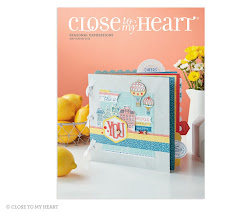
Close to My Heart Inks. I honestly love these ink colors, and especially the card stock coordinates! I love how rich and unique the colors are!


Next up are my Distress Ink pads and markers. It was only through this exercise that I realized I had more pens than ink pads, and I'm lacking quite a bit.


And lastly, my Hero Arts inks. I love love love Hero Arts inks. The colors are so dark and vibrant and it always brings out a pop to whatever project you do! The first column are Shadow Ink colors, and the next 3 columns are the Mid-Tone Shadow Inks . And the very last column are the new Ombre ink pads. I realized I still miss a few ink pads. Maybe this labor day weekend sale somewhere can help me complete the colors.


Lastly, here's the Spectrum Aqua line. After doing this swatch I realized the colors are a bit disappointing. It looks like the ones you buy from Michael's, the Artist Loft brand of watercolors in pans. There's nothing special to the colors really. Or maybe it's just me? After all I'm not an artist. 


Anyways, I hope this helps you guys out there who are planning to buy or just want to have an idea of the colors. It certainly helped me. Especially on the markers, I sort of have an idea which colors blend well and don't, and which ones I have to lay lightly. 

Happy long weekend everyone!

Happy Birthday Embossed Card

Hi All! Today I'm sharing a card that I learned from a Jennifer Mcguire video. I've always wanted to try Pearl-Ex but didn't really know what to do with it. Then I saw Jennifer's video and thought I'd make a quick birthday card for a co-worker of mine whom I didn't know celebrated his birthday on the 1st of Sept.


I used Tim Holtz Distress Inks Blueprint Sketch and Mermaid Lagoon since this card is for a guy. I blended the colors as best I could, but in hindsight could've probably inked less. I brushed  Micropearl Pearl Ex on top of it, then used the Cricut Happy Birthday Embossing Folder to emboss the card. Instead of applying a sentiment, I decided against it given the folder is already heavily texted. I decided to just go clean and simple. Sometimes, less is more.